
CSS 的 clip 只支持矩形,而 clip-path 支持任意形状,而且 clip-path 没 clip 那么娇气,clip-path 并不要求元素为 absolute。
网上有说 Firefox 不支持,错了,Firefox、Chrome 都支持!
向内切矩形
<!DOCTYPE html>

<html>

<head>
<style type="text/css">
div { width:200px; height:200px; background:#00f; }
div { clip-path:inset(10px); }
</style>
</head>

<body>
    <div></div>
</body>

</html>
我不知道我的表述是否清楚。如上 clip-path:inset(10px); 就是说这个 div 上下左右 10px 不显示,只显示中间的 180px。可以看出,clip:rect() 也能实现,但是这个比 clip:rect() 更好理解。
clip-path:inset(10px 50px); 上下 10px 不显示,左右 50px 不显示。
clip-path:inset(10px 50px 50px 10px); 上边 10px、右边 50px、下边 50px、左边 10px 不显示。
显然比 clip:rect() 合理多了。
圆形
<!DOCTYPE html>

<html>

<head>
<style type="text/css">
div { width:200px; height:200px; background:#00f; }
div { clip-path:circle(50px); }
</style>
</head>

<body>
    <div></div>
</body>

</html>clip-path:circle(50px);,半径 50px,圆心在 x=50%、y=50% 的地方。
clip-path:circle(50px at 50px);,半径 50px,圆心在 x=50px、y=50% 的地方。
clip-path:circle(50px at 50px 50px);,半径 50px,圆心在 x=50px、y=50px 的地方。
椭圆
<!DOCTYPE html>

<html>

<head>
<style type="text/css">
div { width:200px; height:200px; background:#00f; }
div { clip-path:ellipse(100px 50px); }
</style>
</head>

<body>
    <div></div>
</body>

</html>
clip-path:ellipse(100px 50px);,同样注意:这是一个参数,使用空格隔开的,表示 x、y 方向的半径。
clip-path:ellipse(100px 50px at 100px 50px);,x 半径为 100px,y 半径为 50px,圆心在 x=100px、y=50px 的地方。
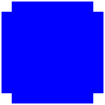
多边形
<!DOCTYPE html>

<html>

<head>
<style type="text/css">
div { width:200px; height:200px; background:#00f; }
div { clip-path:polygon(20px 0, 180px 0, 180px 20px, 200px 20px, 200px 180px, 180px 180px, 180px 200px, 20px 200px, 20px 180px, 0 180px, 0 20px, 20px 20px); }
</style>
</head>

<body>
    <div></div>
</body>

</html>
polygon 参数是 3 个及以上,每个参数用空格隔开表 x、y 的位置,别看上面的参数多,其实就是表示这个多边形的顶点位置,没啥特别的,整个效果如下:
polygon 应用
看下图,注意这个边框是纯 CSS 实现的。
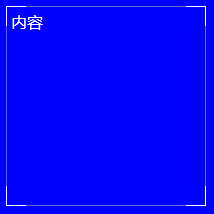
代码如下:
<!DOCTYPE html>

<html>

<head>
<style type="text/css">
body { background:blue; }

.box { position:relative; box-shadow:inset 0 0 0 1px #fff; width:200px; height:200px; }
.box::after { content:''; display:block; position:absolute; top:0; left:0; box-shadow:inset 0 0 0 1px #66c; width:200px; height:200px; }
.box::after { clip-path:polygon(20px 0, 180px 0, 180px 20px, 200px 20px, 200px 180px, 180px 180px, 180px 200px, 20px 200px, 20px 180px, 0 180px, 0 20px, 20px 20px); }
</style>
</head>

<body>
	<div class="box">
		<div style="padding:5px; color:#fff;">内容</div>
	</div>
</body>

</html>
上述是通过 2 层边线实现的。
没有使用 border,因为 border 不可重叠,使用 box-shadow 来实现 border 效果。
after 中 display:block; 是为了实现 after 中元素有宽高。
after 中 position:absolute; top:0; left:0; 是为了避免占用内部其他元素的空间。
支持 calc 吗?
polygon 中的位置点,除了写死,支持使用 calc 来算吗?支持。
相关阅读

